2022 Hyundai Tucson driveway and infotainment test | No knobs? No probs
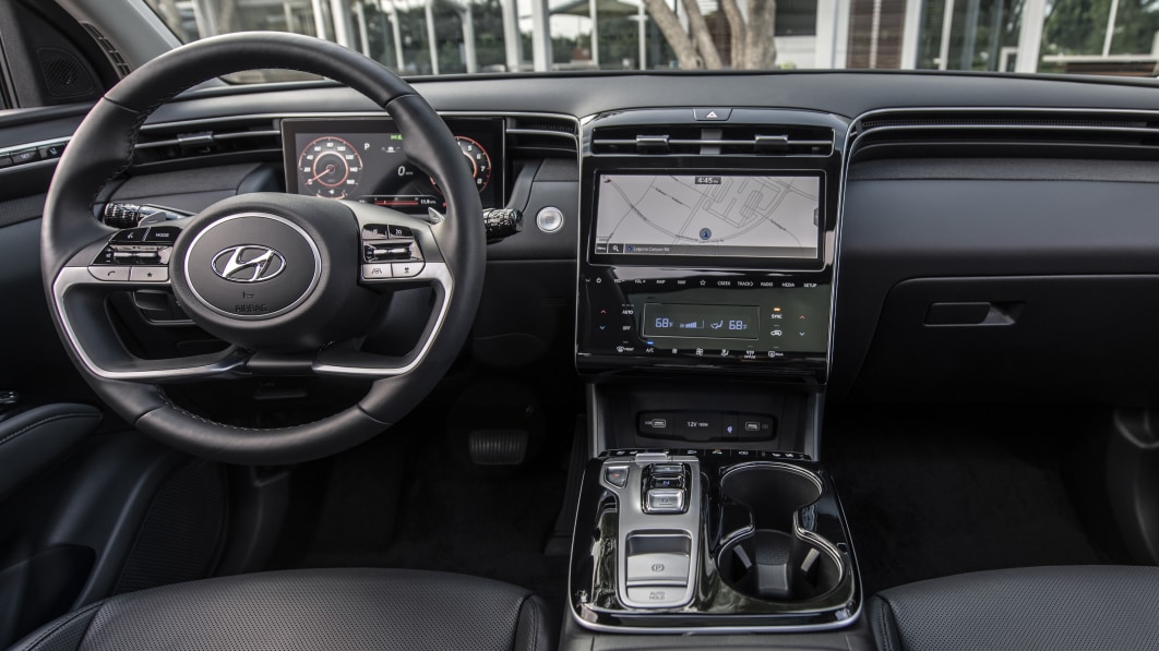
Hyundai’s 2022 redesign of its compact Tucson was about as comprehensive as they come. The switch to a new chassis brought with it a larger and more usable interior package, a redesigned cabin and a new set of powertrains. The interior overhaul included a brand-new infotainment system that happens to be suspiciously free of knobs. Harrumph.
The interior of the 2022 Hyundai Tucson is a very nice place to be ##hyundai ##cars ##carsoftiktok
After spending a day with a 2022 Tucson hybrid earlier this year, I came away very impressed by the interior, as you can tell from the TikTok clip above. It looks great, feels great, and apart from a few small quibbles (like the volume controls and push-button gear selector), is fairly conventionally and intuitively laid out. If anything, I expected the lack of physical controls to be my biggest gripe with the Tucson long-term, but that turned out not to be the case.
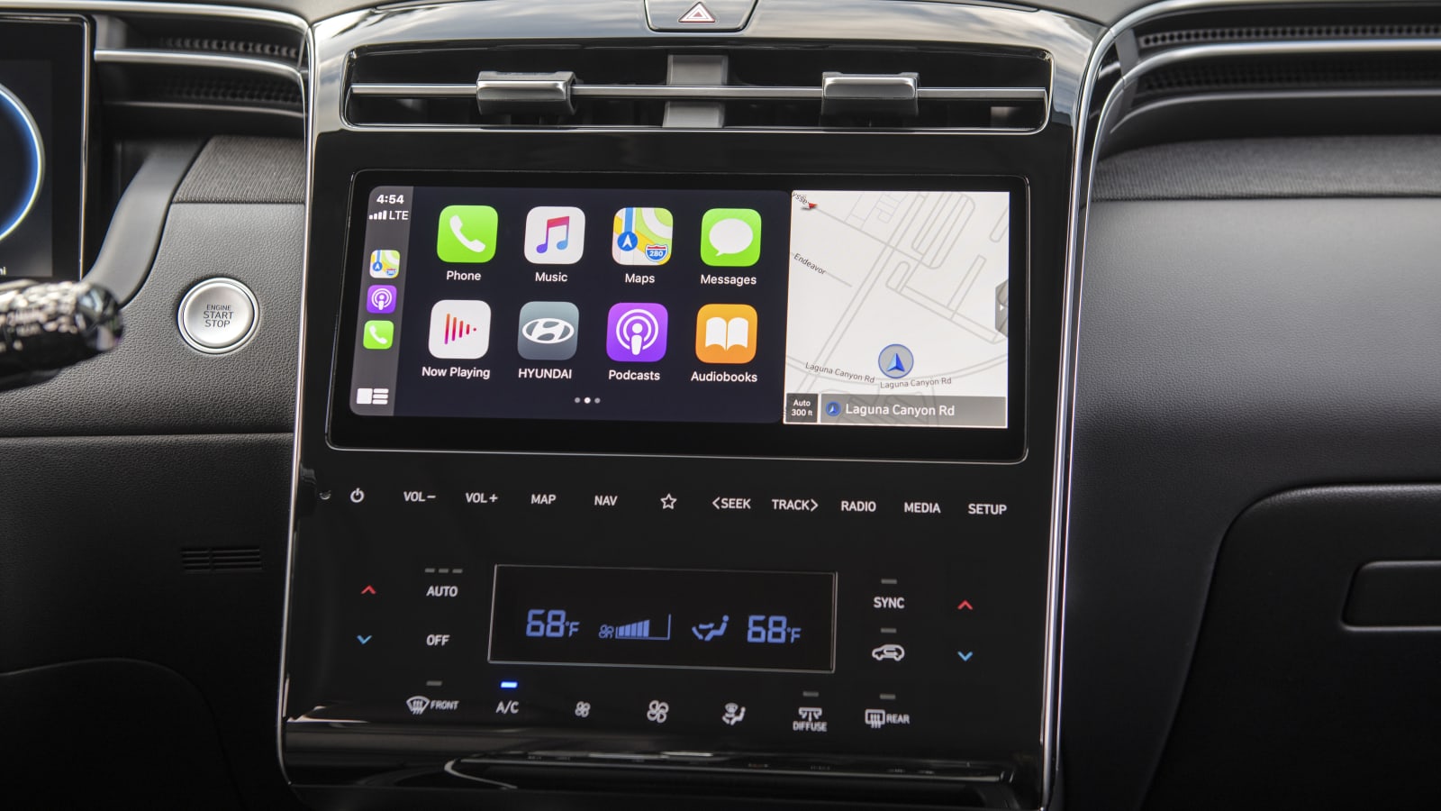
Let’s start with the obvious: it works. Functionally, the Tucson’s infotainment is no different than what we’ve seen in Hyundai’s other recent offerings. The 10.25-inch screen looks larger than its dimensions suggest here (the Sonata’s is 12.3 inches, for comparison) because it sits flush with the large, glossy bezel that houses all of the capacitive control surfaces. Yes, you have to hunt around for controls and the lack of tactile feedback can be frustrating, especially if you’re on a bumpy road and pecking at one of the smaller toggles. But Hyundai included an audible “beep” for each of its capacitive buttons, so at least you know your inputs have been accepted.
It also helps that Hyundai’s voice controls are quite good. I happened to spend time in the new Tucson and a 2021 Ford Mustang on the same day, and was struck by just how much smarter the Hyundai’s language recognition is. The older version of Sync in the Mustang required the use of specific keywords to access certain features, which ends up being the voice equivalent of menu-diving. The Hyundai? Just tell it what you want; 9 times out of 10, it’ll understand. Plus, the center console does still house quite a few redundant physical controls, including those for the climate control, heated/ventilated seats and heated steering wheel.
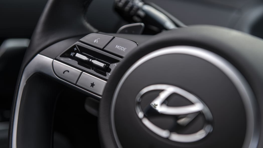
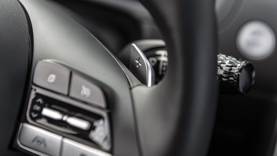
The wheel itself has volume and tuning controls, plus those for the cluster menus, from which you have control over most of the driving aids and other driver-centered features, meaning there’s no need to dig into the infotainment system or even reach for the stack-mounted volume controls at all. It also has an instant-access button for your favorite feature, which you can designate from within the main screen’s settings menu. Think of it like a bookmark you can customize. You can even turn it into a power button for the entire system, if you’d like, and there’s a redundant toggle for it beneath the touchscreen so your passenger can reach it too.
All in, it’s not bad. Yeah, it would be better with a knob, but compared to other systems that have made the same transition, it’s among the best. I can live with it.
Related video:

